| |
TRADING IDEAS
Basics of Technical Analysis |
New to Trading and Technical Analysis? Learn the Basics
of Technical Analysis of Indian Stocks and Stock Market
Trend Stock Charts and Trends.
| Stock
Charts |
 |
| |
|
Stock charts gained
popularity in the late 19th Century from the
writings of Charles H. Dow in the Wall Street
Journal. His comments, later known as "Dow
Theory", alleged that markets move in all kinds of
measurable trends and that these trends could be
deciphered and predicted in the price movement
seen on all charts.
FUNDAMENTAL ANALYSIS seeks to determine
future stock price by understanding and
measuring the objective "value" of an equity. The
study of stock charts, known as TECHNICAL
ANALYSIS, believes that the past action of the
market itself will determine the future course of
prices.
A stock chart is a simple two-axis (x-y)
plotted graph of price and time. Each
individual equity, market and index listed on a
public exchange has a chart that illustrates this
movement of price over time. Individual data plots
for charts can be made using the CLOSING price for
each day. The plots are connected together in a
single line, creating the graph. Also, a
combination of the OPENING, CLOSING, HIGH and/or
LOW prices for that market session can be used for
the data plots. This second type of data is called
a PRICE BAR. Individual price bars are then
overlaid onto the graph, creating a dense visual
display of stock movement.
Stock charts can be created in many
different time frames. Mutual fund holders use
monthly charts in which each individual data plot
consists of a single month of activity. Day
traders use 1 minute and 5 minute stock charts to
make quick buy and sell decisions. The most common
type of stock chart is the daily plot, showing a
single complete market session for each unit.
Stock charts can be drawn in two different
ways. An ARITHMETIC chart has equal vertical
distances between each unit of price. A
LOGARITHMIC chart is a percentage growth chart. It
has equal vertical distances between the same
percentages of price growth. For example, a price
movement from 10 to 20 is a 100% move. A move from
20 to 40 is also a 100% move. For this reason, the
vertical distance from 10 to 20 and the vertical
distance from 20 to 40 will be identical on a
logarithmic chart.
Stock chart analysis can be applied equally
to individual stocks and major indices. Analysts use their technical research on index
charts to decide whether the current market is a
BULL MARKET or a BEAR MARKET. On individual
charts, investors and traders can learn the same
thing about their favorite companies. |
| |
|
| |
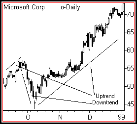
| Trends |
 |
| |
|
Use the stock chart to
identify the current trend. A trend reflects
the average rate of change in a stock's price over
time. Trends exist in all time frames and all
markets. Day traders can establish the trend of
their stocks to within minutes. Long term
investors watch trends that persist for many
years.
Trends can be classified in three ways: UP, DOWN or RANGEBOUND.
In an uptrend, a stock rallies often
with intermediate periods of consolidation or
movement against the trend. In doing so, it draws
a series of higher highs and higher lows on the
stock chart. In an uptrend, there will be a
POSITIVE rate of price change over time.
In a downtrend, a stock declines often
with intermediate periods of consolidation or
movement against the trend. In doing so, it draws
a series of lower highs and lower lows on the
stock chart. In a downtrend, there will be a
NEGATIVE rate of price change over time.
Rangebound price swings back and forth for long periods between easily seen upper and
lower limits. There is no apparent direction to
the price movement on the stock chart and there
will be LITTLE or NO rate of price change.
Trends tend to persist over time. A
stock in an uptrend will continue to rise until
some change in value or conditions occurs.
Declining stocks will continue to fall until some
change in value or conditions occurs. Chart
readers try to locate TOPS and BOTTOMS, which are
those points where a rally or a decline ends.
Taking a position near a top or a bottom can be
very profitable.
Trends can be measured using TRENDLINES. Very often a straight line can be drawn UNDER
three or more pullbacks from rallies or OVER
pullbacks from declines. When price bars then
return to that trendline, they tend to find
SUPPORT or RESISTANCE and bounce off the line in
the opposite direction.
A famous quote about trends advises that
"The trend is your friend". For traders and
investors, this wisdom teaches that you will have
more success taking stock positions in the
direction of the prevailing trend than against
it. |
|
| |
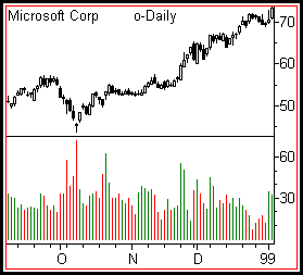
| Volume |
 |
| |
|
Volume measures the
participation of the crowd. Stock charts
display volume through individual HISTOGRAMS below
the price pane. Often these will show green bars
for up days and red bars for down days. Investors
and traders can measure buying and selling
interest by watching how many up or down days in a
row occur and how their volume compares with days
in which price moves in the opposite direction.
Stocks that are bought with greater interest
than sold are said to be under ACCUMULATION. Stocks that are sold with great interest than
bought are said to be under DISTRIBUTION.
Accumulation and distribution often LEAD price
movement. In other words, stocks under
accumulation often will rise some time after the
buying begins. Alternatively, stocks under
distribution will often fall some time after
selling begins.
It takes volume for a stock to rise but it
can fall of its own weight. Rallies require
the enthusiastic participation of the crowd. When
a rally runs out of new participants, a stock can
easily fall. Investors and traders use indicators
such as ON BALANCE VOLUME to see whether
participation is lagging (behind) or leading
(ahead) the price action.
Stocks trade daily with an average volume
that determines their LIQUIDITY. Liquid stocks
are very easy for traders to buy and sell.
Illiquid stocks require very high SPREADS
(transaction costs) to buy or sell and often
cannot be eliminated quickly from a portfolio.
Stock chart analysis does not work well on
illiquid stocks.
Breakouts accompanied by volume much higher
than the average for that stock are healthy
for the continuation of the price movement in that
direction. But after long rallies or declines,
stocks often have a day of very high volume known
as a CLIMAX. During these days, the last of the
buyers or sellers take positions. The stock then
reverses as there are no longer enough
participants to cause price to move in that
direction. |
|
| |
| Patterns and
Indicators |
 |
| |
|
How can you organize the
endless stream of stock chart data into a logical
format that doesn't require rocket science to
interpret? Charts allow investors and traders to
look at past and present price action in order to
make reasonable predictions and wise choices. It
is a highly visual medium. This one fact separates
it from the colder world of value-based analysis.
The stock chart activates both left-brain
and right-brain functions of logic and creativity. So it's no surprise that over the last century
two forms of analysis have developed that focus
along these lines of critical examination.
The oldest form of interpreting charts is
PATTERN ANALYSIS. This method gained
popularity through both the writings of Charles
Dow and Technical Analysis of Stock
Trends, a classic book written on the
subject just after World War II. The newer form of
interpretation is INDICATOR ANALYSIS, a
math-oriented examination in which the basic
elements of price and volume are run through a
series of calculations in order to predict where
price will go next.
Pattern analysis gains its power from the
tendency of charts to repeat the same bar
formations over and over again. These patterns
have been categorized over the years as having a
bullish or bearish bias. Some well-known ones
include HEAD and SHOULDERS, TRIANGLES, RECTANGLES,
DOUBLE TOPS, DOUBLE BOTTOMS and FLAGS. Also, chart
landscape features such as GAPS and TRENDLINES are
said to have great significance on the future
course of price action.
Indicator analysis uses math calculations to
measure the relationship of current price to past
price action. Almost all indicators can be
categorized as TREND-FOLLOWING or OSCILLATORS.
Popular trend-following indicators include MOVING
AVERAGES, ON BALANCE VOLUME and MACD. Common
oscillators include STOCHASTICS, RSI and RATE OF
CHANGE. Trend-following indicators react much more
slowly than oscillators. They look deeply into the
rear view mirror to locate the future. Oscillators
react very quickly to short-term changes in price,
flipping back and forth between OVERBOUGHT and
OVERSOLD levels.
Both patterns and indicators measure market
psychology. The core of investors and traders
that make up the market each day tend to act with
a herd mentality as price rises and falls. This
"crowd" tends to develop known characteristics
that repeat themselves over and over again. Chart
interpretation using these two important analysis
tools uncovers growing stress within the crowd
that should eventually translate into price
change. |
|
| |
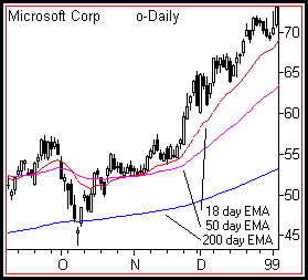
| Moving
Averages |
 |
| |
|
The most popular
technical indicator for studying stock charts is
the MOVING AVERAGE. This versatile tool has
many important uses for investors and traders.
Take the sum of any number of previous CLOSE
prices and then divide it by that same number. This creates an average price for that stock
in that period of time. A moving average can be
displayed by recomputing this result daily and
plotting it in the same graphic pane as the price
bars. Moving averages LAG price. In other words,
if price starts to move sharply upward or
downward, it will take some time for the moving
average to "catch up".
Plotting moving averages in stock charts
reveals how well current price is behaving as
compared to the past. The power of the moving
average line comes from its direct interaction
with the price bars. Current price will always be
above or below any moving average computation.
When it is above, conditions are "bullish". When
below, conditions are "bearish". Additionally,
moving averages will slope upward or downward over
time. This adds another visual dimension to a
stock analysis.
Moving averages define STOCK TRENDS. They can be computed for any period of time.
Investors and traders find them most helpful when
they provide input about the SHORT-TERM,
INTERMEDIATE and LONG-TERM trends. For this
reason, using multiple moving averages that
reflect these characteristics assist important
decision making. Common moving average settings
for daily stock charts are: 20 days for
short-term, 50 days for intermediate and 200 days
for long-term.
One of the most common buy or sell signals
in all chart analysis is the MOVING AVERAGE
CROSSOVER. These occur when two moving
averages representing different trends
criss-cross. For example, when a short-term
average crosses BELOW a long-term one, a SELL
signal is generated. Conversely, when a short-term
crosses ABOVE the long-term, a BUY signal is
generated.
Moving averages can be "speeded up" through
the application of further math calculations. Common averages are known as SIMPLE or SMA.
These tend to be very slow. By giving more weight
to the current changes in price rather than those
many bars ago, a faster EXPONENTIAL or EMA moving
average can be created. Many technicians favor the
EMA over the SMA. Fortunately all common stock
chart programs, online and offline, do the
difficult moving average calculations for you and
plot price perfectly. |
|
| |
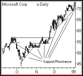
| Support and
Resistance |
 |
| |
|
The concept of SUPPORT
AND RESISTANCE is essential to understanding and
interpreting stock charts. Just as a ball
bounces when it hits the floor or drops after
being thrown to the ceiling, support and
resistance define natural boundaries for rising
and falling prices.
Buyers and sellers are constantly in battle
mode. Support defines that level where buyers
are strong enough to keep price from falling
further. Resistance defines that level where
sellers are too strong to allow price to rise
further. Support and resistance play different
roles in uptrends and downtrends. In an uptrend,
support is where a pullback from a rally should
end. In a downtrend, resistance is where a
pullback from a decline should end.
Support and resistance are created because
price has memory. Those prices where
significant buyers or sellers entered the market
in the past will tend to generate a similar mix of
participants when price again returns to that
level.
When price pushes above resistance, it
becomes a new support level. When price falls
below support, that level becomes resistance. When
a level of support or resistance is penetrated,
price tends to thrust forward sharply as the crowd
notices the BREAKOUT and jumps in to buy or sell.
When a level is penetrated but does not attract a
crowd of buyers or sellers, it often falls back
below the old support or resistance. This failure
is known as a FALSE BREAKOUT.
Support and resistance come in all varieties
and strengths. They most often manifest as
horizontal price levels. But trendlines at various
angles represent support and resistance as well.
The length of time that a support or resistance
level exists determines the strength or weakness
of that level. The strength or weakness determines
how much buying or selling interest will be
required to break the level. Also, the greater
volume traded at any level, the stronger that
level will be.
Support and resistance exist in all time
frames and all markets. Levels in longer time
frames are stronger than those in shorter time
frames. |
|
New to Trading and Technical Analysis? Learn the Basics
of Technical Analysis of Indian Stocks and Stock Market
Trend Stock Charts and Trends. |
|
|
|
|
|
